Maud Lewis

Maud Lewis was a Canadian artist who created beautiful folk art despite suffering terribly from rheumatism. The film “Maudie” detailed her life. I think it’s still on Netflix.

She was a talented folk art painter even going to the extent of painting every surface of her tiny one room home. Her entire house is preserved inside the Art Gallery of Nova Scotia. There’s even a virtual tour which is worth looking through.

On WetCanvas, which is still alive despite the owners, we have a monthly challenge in the acrylics forum. The theme for May’s challenge (I know I know I’m late posting but I don’t think anyone is reading this, blogs seem to be passe but I’m good with talking to myself!) was to either do a study of one of her paintings or do your own inspired by one of her paintings.

Folk Art seems easy but funnily enough more people had a hard time with this than with other genres or subjects in past challenges.

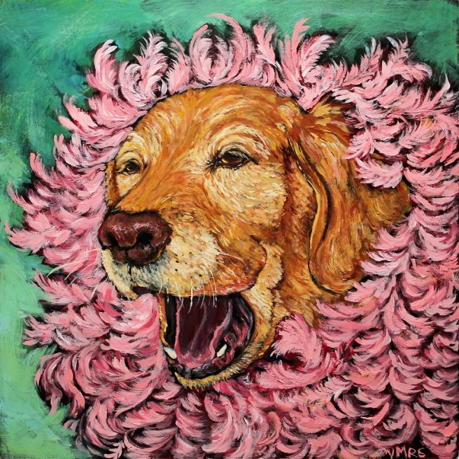
These are mine. The first one is based on her “Snow dog” but instead of her white dog I used my Tallie. This is 2.5 x 3.5 inches.

A happy folk art painting of a yellow labrador retriever, dog, in a garden of tulips with plum blossoms overhead
Tallie in the Tulips

The second is a copy of “Eddie Barnes and Ed Murphy Going Fishing” 13.7 x 12.5 inches. I used some crackle on it as I had a tonne left from another project.

Folk art painting of a ship going out to fish. A landmass with a lighhouse and several other buildings can be seen in the background.
Study of Maud Lewis’s “Eddie Barnes and Ed Murphy Going Fishing”

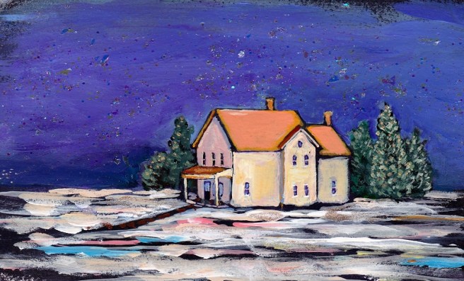
The big one is 20 x 16 inches and is the top half of the inside of her storm door as seen in the museum. I had fun painting the canvas to look like wood!

Folk art painting of a door with a painting of a blue bird and flowers in a red vase.
Maud’s Door.

I enjoyed this challenge so much. Folk art is a genre I rarely do but appreciate more than any other.

I hope you enjoyed looking. As always, if you have a question, please ask in the comments below.

©Virginia Spencer, thepurpledogpaintingblog.com, 2022
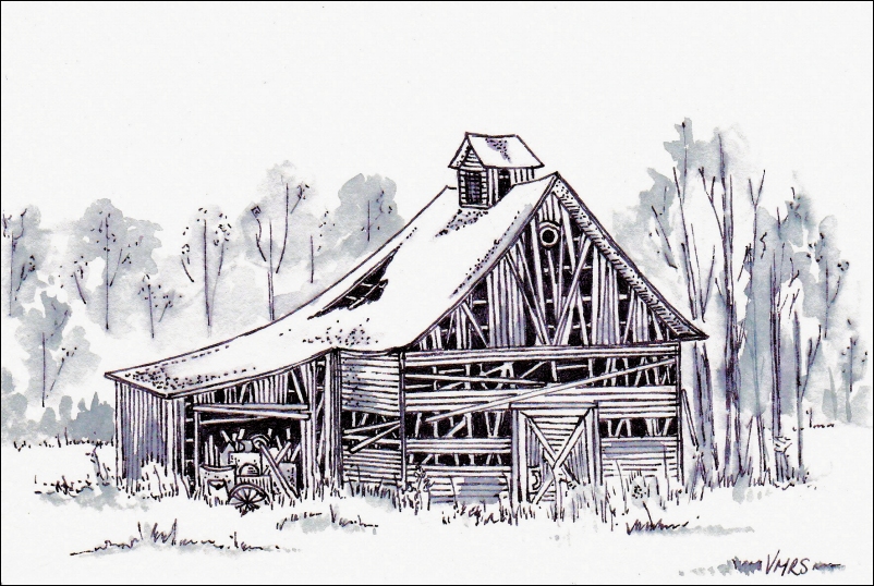
Abstraction and impressionism

This whole year has been an abstraction and I’m not impressed with it but I hope it’s finding you well.

I did these as part of a challenge over at WetCanvas. I got right in there with fingers and palette knives and large brushes. These all started out as innocent sheets of 12×18 watercolor paper, they ended up being various sizes depending on how much I tore the paper. I ruined a couple of brushes and one shirt but it was thoroughly entertaining.

These are some of my favourite places.

“The landscape”
“Water’s Edge, Niagara”
“Horseshoe Falls, Niagara”
“Sailing”
“The beach”
“The field”

Let me know in the comments what you think. If you’re on Instagram, give me a shout over there, so I can follow you, I mean that in a general Instagram way not like a deranged stalker or anything.

Stay safe and healthy.

©Virginia Spencer, thepurpledogpaintingblog.com, 2021

Art by the Foot Project

We are still reeling from the unexpected loss of Zeus. We have lost family, friends and pets before as many of you have but this loss was such a shock. We still find ourselves reeling from it. We all miss him terribly.

Poor Sampson is of course devastated. They hadn’t been apart in over ten years. We know it will take him some time to adjust but for now we are taking extra care with him, the poor guy.

I did this acrylic of Zeus, it’s a foot square and will be on display at the Figge Museum in Davenport as part of a community art project.

This piece is also on display. It is again on a one foot foam square. The museum gave each artist two to paint on. This is a mixed media piece with acrylic, a linoprint and pen drawing.  It is the lino print of the north wind but reversed from the one I showed you in a prior post. I added it to a stormy acrylic sky with a pen and ink drawing of the man that the Sun and North Wind were toying with.

I did it at the last minute over another painting so I hope that it holds up on display. I’m a bit nervous about it.

If you’re in the Quad Cities area,  The Art by the Foot exhibit is open and it displays art made by artists of all ages and abilities from the Quad-City area. The works were collected this spring and were required to be made on boards provided by the Figge. All of the works will be on view in the Mary Waterman Gildehaus Community Gallery from June 20th to September 1st.

I have to say, I love this idea and I thought it so clever of the museum to give artists this chance. I also love that it ranges from professionals to small children. That sort of encouragement is priceless!

.

©Virginia Spencer, thepurpledogpaintingblog.com, 2019


Groundhog

This is a 6×4 pencil crayon drawing on pastel paper.

Now if you’re wondering what pencil crayons are, they are what Americans called coloured pencils. Even though I’ve lived in the States for many years and sometimes use color instead of colour, and I almost never say toque and I  rarely drink a mickey or two-four… sure rarely sounds about right…anyway I can’t give up my pencil crayon terminology ..

Anyway here’s a grumpy groundhog. Not sure what he’s grumpy about unless he’s an American groundhog and would have preferred to be done with colored pencils. Sorry buddy..not in this house!

©Virginia Spencer, thepurpledogpaintingblog.com, 2019

Linocuts of “The North Wind & the Sun”

These linocuts were done on a 5×7 inch “Easy-to-Cut” lino from Jack Richeson & Co.Inc. It claims that it “Cuts like butter” and it does! I quite like it.
Apparently you can carve on both sides as well but I haven’t tried that yet.
.
This lino is based on Aesop’s fable “The North Wind & The Sun”. You can find the story with sound effects even at  the Library of Congress’s website. Check it out, it is a fantastic site.
.
I’ve experimented with different color papers, they are framed in the matte colors shown here though I added these with the computer as the original colors wouldn’t scan well.
.
I was trying for a folk artsy sort of style. I think the smudges add interest.
.
That’s my story and I’m sticking to it!
.
This one is my favourite, the black and red ink melded into an interesting pattern I thought

These two are so bright, heck yeah!

This next one is a bit more subdued color wise, I added a bit of embellishment with acrylic markers.

If you have any questions, ask away.

©Virginia Spencer, thepurpledogpaintingblog.com, 2019

Painting from the Masters.

I recently did an ATC trade on WetCanvas.com. The theme was “Painting from the Masters”. We weren’t  picky on what master/artist it was as long as the work we were copying were made before 1923.

An ATC is an artist trading card. They are 3.5 x 2.5 inches, the size of a traditional playing card.

This card is based on Berthe Morisot’s “Woman at her Toilette”. Morisot was an impressionist. She studied with landscape painter Jean-Baptiste Camille Corotin and in Paris under the tutelage of Joseph Guichard who had her copy Masters at the Louvre. I’m sure she would enjoy knowing that people are copying her! My version is in acrylic on 300 gsm watercolor paper.

This card is also in acrylic on watercolor paper. The original by Canadian, Helen Galloway McNicoll, was called “Buttercups”. McNicoll studied under William Brymer in Montreal. She also painted in Britain as a member of the Royal British Society of Artists and was vice-president of the Society of Women Artists. She was one of the few impressionist who was able to make a financially secure living from her art. She was deaf since childhood and died young from diabetes at the age of 35.

This card is based on a wooden panel painted by John La Farge simply titled “Fish”.. He was a member of the Arts and Crafts Movement and was noted for his stained glass windows. He designed windows for the Trinity Church in Boston and Memorial Hall at Harvard.

To make this card look like wood I first did a ocher undercoat. When that was dry I painted over it with a thicker coat of an ocher/red mix. When that was almost dried, I gently scratched out wood grain like patterns with the edge of a palette knife and let it dry before adding the fish and decorations.

It was interesting copying the works of others but I have a tendency to change them to how I would like them to look, very cheeky I know but I can’t seem to help myself!


©Virginia Spencer, thepurpledogpaintingblog.com, 2019


December Acrylics

These are some cards I made for a trade. They are all acrylic and in various card sizes, all smaller than 5×6. The first five were done with palette knives, some have a bit of brushwork.

It’s a challenge to use a knife on small pictures but it is entertaining.

This deer makes me laugh, he looked rather affronted at being painted.

“Deer Interrupted”

painting acrylic deer

“The Tree and the Icy River”

“Red and Gold Berry Christmas Tree”

“Snowy Path and Tree”

Palette leftovers.

The following are brushwork.

“A Small Fir”

“The Birches”

“Under a Purple Sky”

“The Firs”

.

©Virginia Spencer, thepurpledogpaintingblog.com, 2018

Odds and Ends of the year.

This is a horse with tattoos, everyone has them now.

Ink and marker, 8×10 inches.

This is a lino print with Brusho (a watercolor product). 5×7 inches.

A quick drawing of a guy named Steve.

A cat that I embroidered on my apron because I like to be fancy when I’m cooking. This design is an original and is about 5×7 inches.

A photograph of a shadow from a lamp that looks like the Eiffel Tower.

A sepia self portrait, titled “Closer than she appears.”

The Chicago Waterfront.

And the Wells Fargo Bank reflected in the windows of the Figge Museum in Davenport, Iowa. My favourite painting ” Blue Horse” by Marc Chagall lives at the Figge.

.

©Virginia Spencer, thepurpledogpaintingblog.com, 2018


Brusho, Lino carving and other ways to muck your hands up..

Recently I was given a gift of Brusho.  I had never seen it before so I dove into it right away.

brusho-color-art

A few things you should know if you’re going to try Brusho out..

1) It stains like a stainy staining stain. I was green and blue for a good bit. Now I don’t mind being various colors and Sampson of course has a habit of being various shades of color but from what I understand some people don’t think it’s quite normal to walk around with paint and ink all over them. Be careful or wear gloves. Don’t use this over a good rug or table or what have you.

2) Don’t open the lid, tempting as it is, simply take a sharp implement, a nail or such and stab the lid with it. Do not stab yourself or anyone else.

After I punctured the top, I used little round stickers (Avery coloring coded labels for files) to close them up. It’s not necessary but for some reason I have a tonne of those stickers.

brusho-set-art-stickers

3) If you live in a humid area, you might want to get one of those silica gels things to keep in the box with them or put some rice in there. They are a crystalized salt sort of thing. I live near the Mississippi which is a muggy muddy river, I noticed within a week that it was too humid for them.

4) To activate the Brusho, you shake a bit out onto paper then spray it with water. Test your sprayer first. The first one I used was so powerful, it shot the crystals all over the place. The second was too weak and made puddles. I did find a purse sized one that had had eye glass cleaner in it and that worked well.

5) A little bit goes a long long way. Do some tests to see how much you want to use. It’s pretty vivid and of course mixing complementary colors will get you mud. Complementary colors are colors that are opposite each other on the color wheel..green and red, blue and orange, purple and yellow and so on.

6)You can use it as a fine art sort of watercolor by dropping a little bit in a palette well and adding water. I did not do that. I did watch youtube videos about it.  There’s a good tutorial here for a fine art landscape. This lady’s youtube channel shows how to use it more for crafts like card making.

I used a white crayon to make a quick line drawing. I then sprinkled some of the Brusho on and sprayed it. I use the thingy that blows dust off my camera lens to move some of the colors around. The whole thing took maybe five minutes.

brusho-watercolor-painting

I also used some on a sketch that I hadn’t finished. That made for a fun effect.

brusho-art-watercolor-painting.

It was entertaining to use but a bit of a pain in the ass.

I also decided to take up lino cutting. I did it once ages ago in high school. I remembered loving it.

Plus I had a coupon.

This is my test piece, it’s 6×2 inches.

lino-ink-art-printing

Then I went a little crazy..

lino-art-first-printing-ink

And I ran out of paper so  I printed on the Brusho..

lino print painting art brusho.

I need to get more paper.

Lots and lots of paper!

See you soon.

.

.

©Virginia Spencer, thepurpledogpaintingblog.com, 2017


.